About
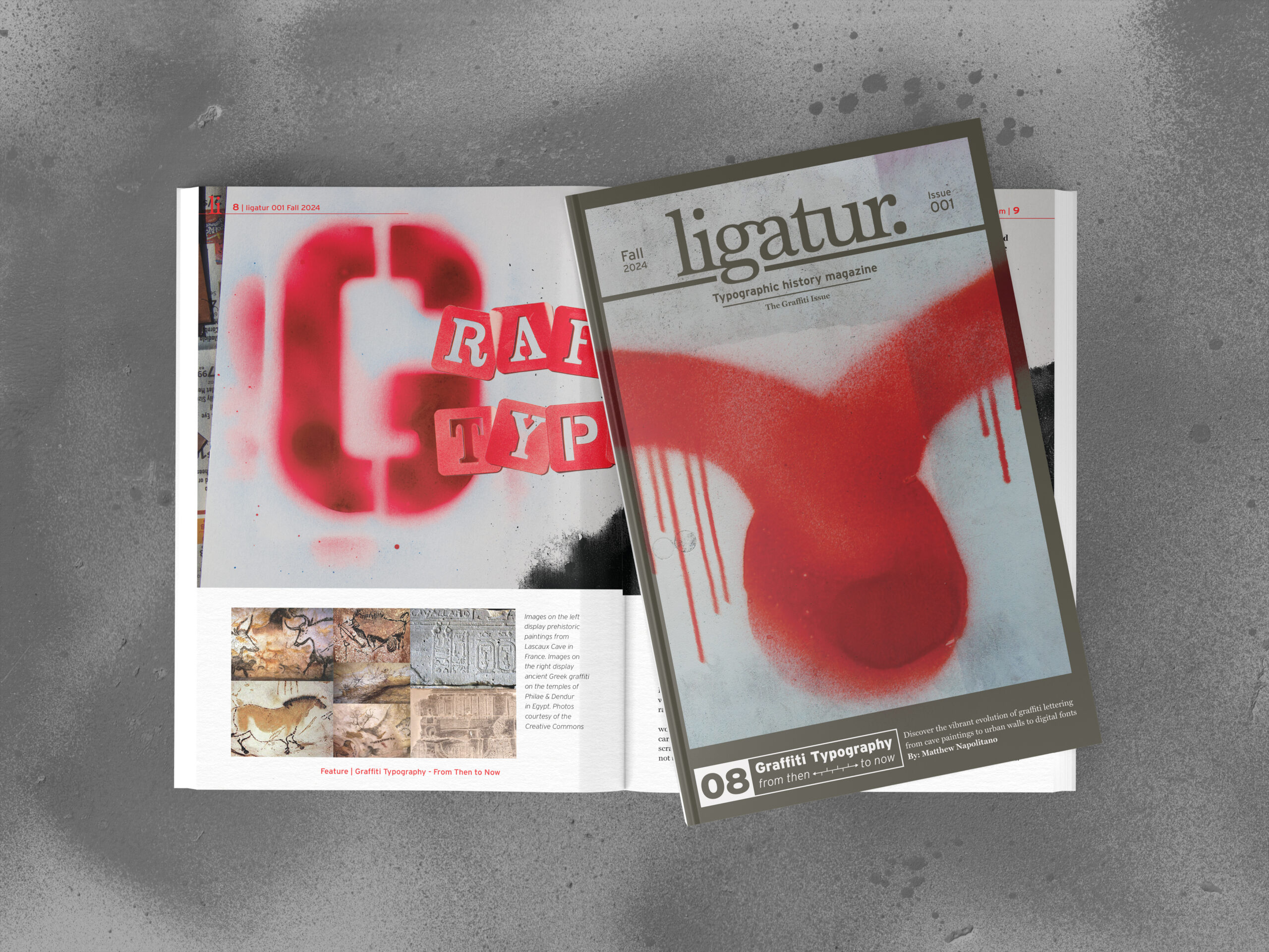
Ligatur. is a 6×9in typography publication released bi-annually — a format chosen deliberately. The smaller trim size distinguishes it from letter-size competitors, improves portability, and reinforces the brand’s understated voice. The bi-annual schedule aligns with university semesters, reflecting that students and designers make up the core readership. The name carries a double meaning: a ligature is a typographic feature connecting two or more letterforms, mirroring how the magazine connects typographic history to the present day. The German spelling nods to Germany’s outsized influence on the field — from Gutenberg’s press to the Bauhaus.
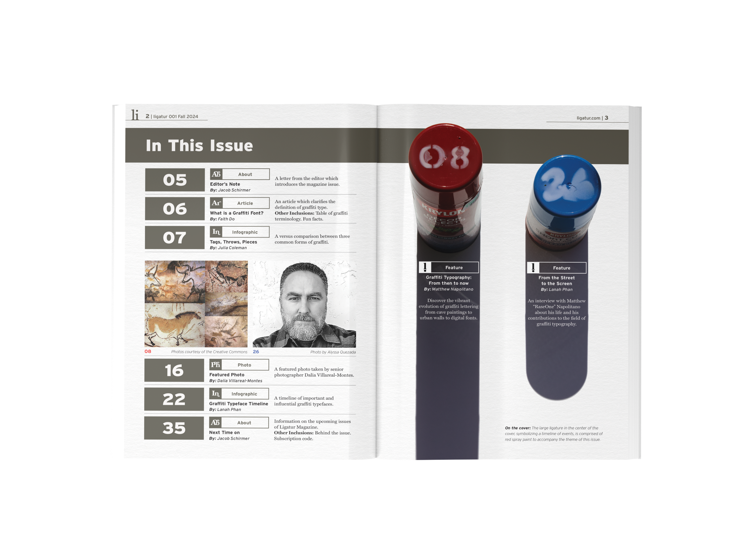
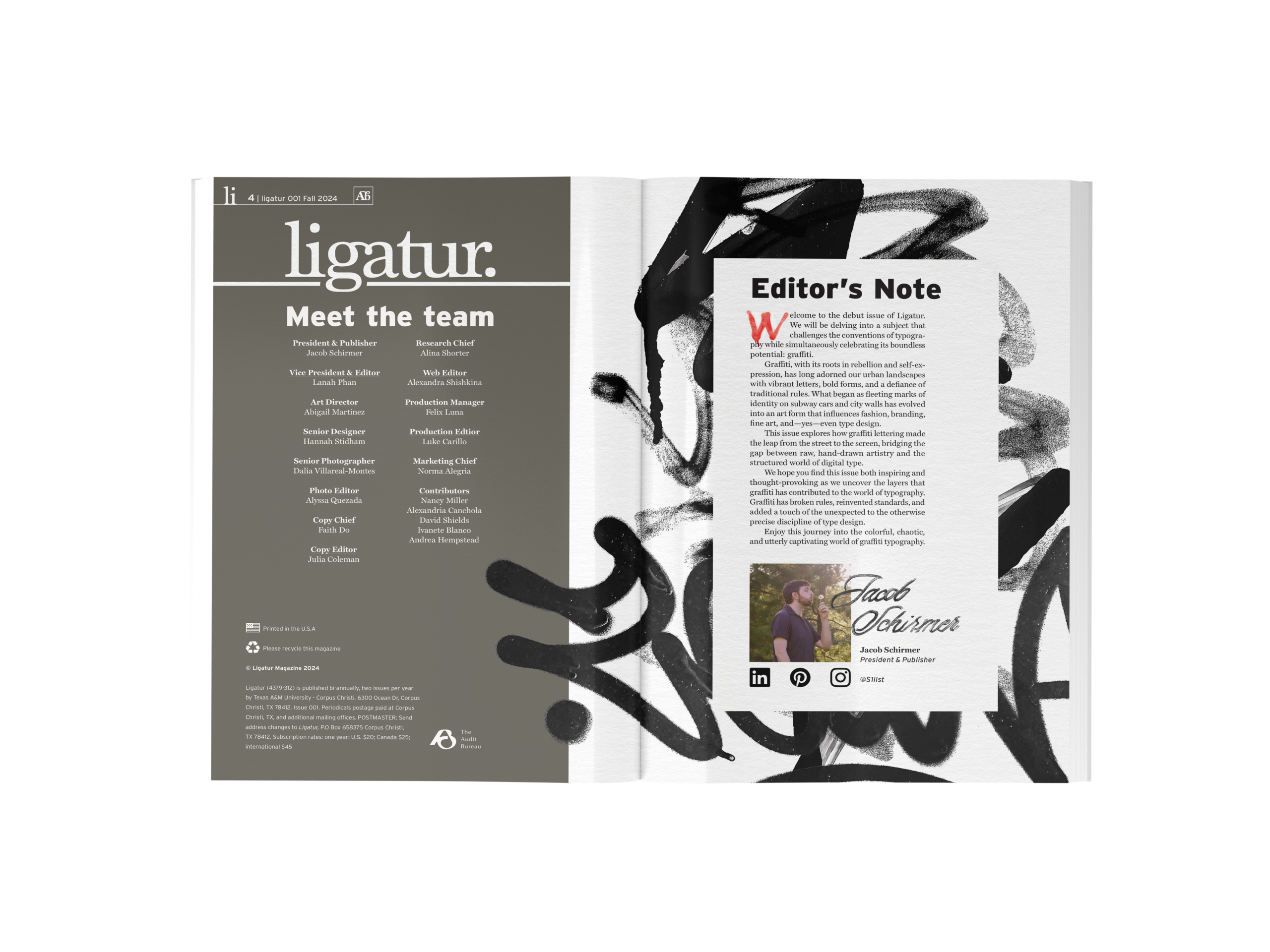
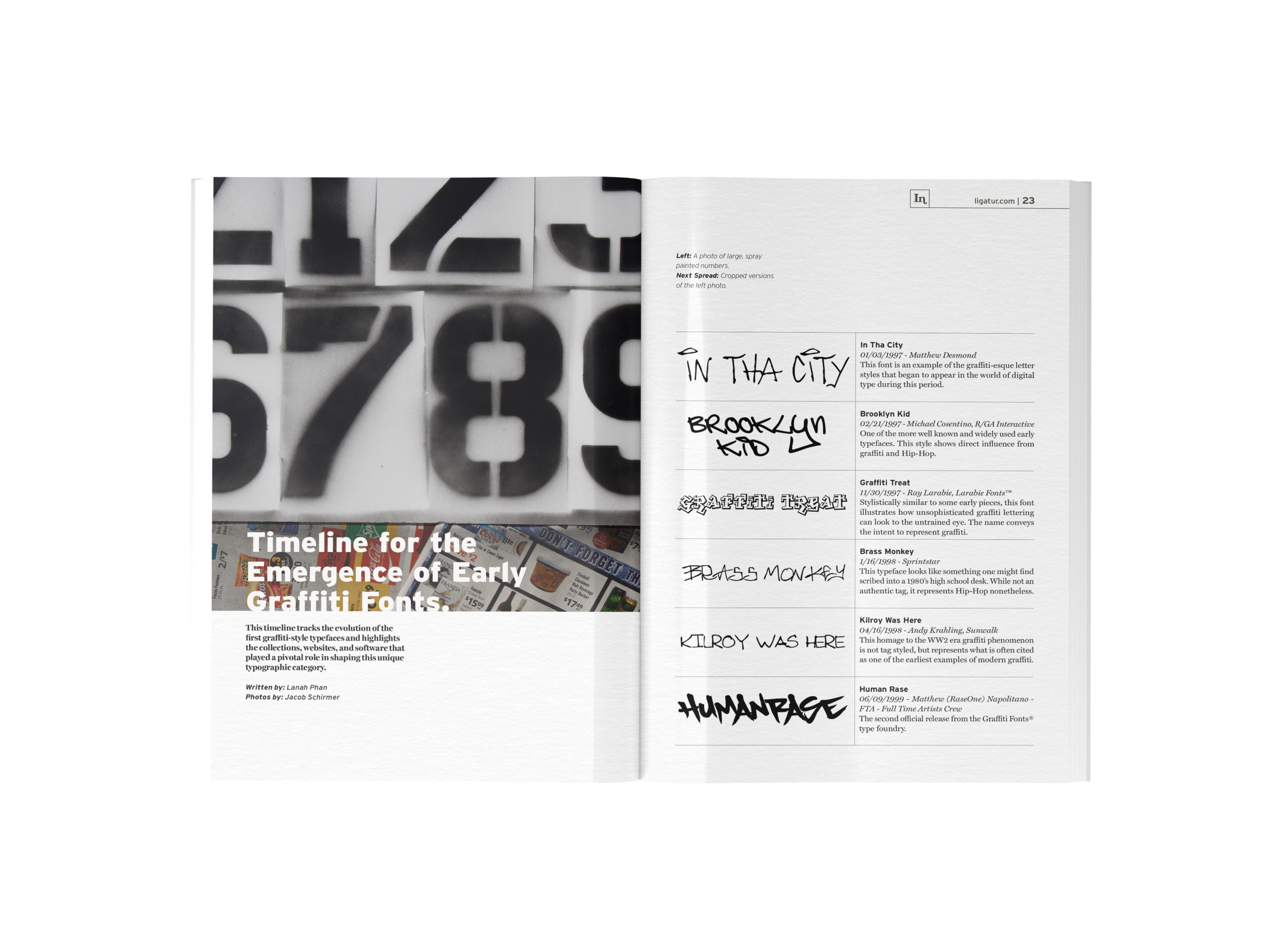
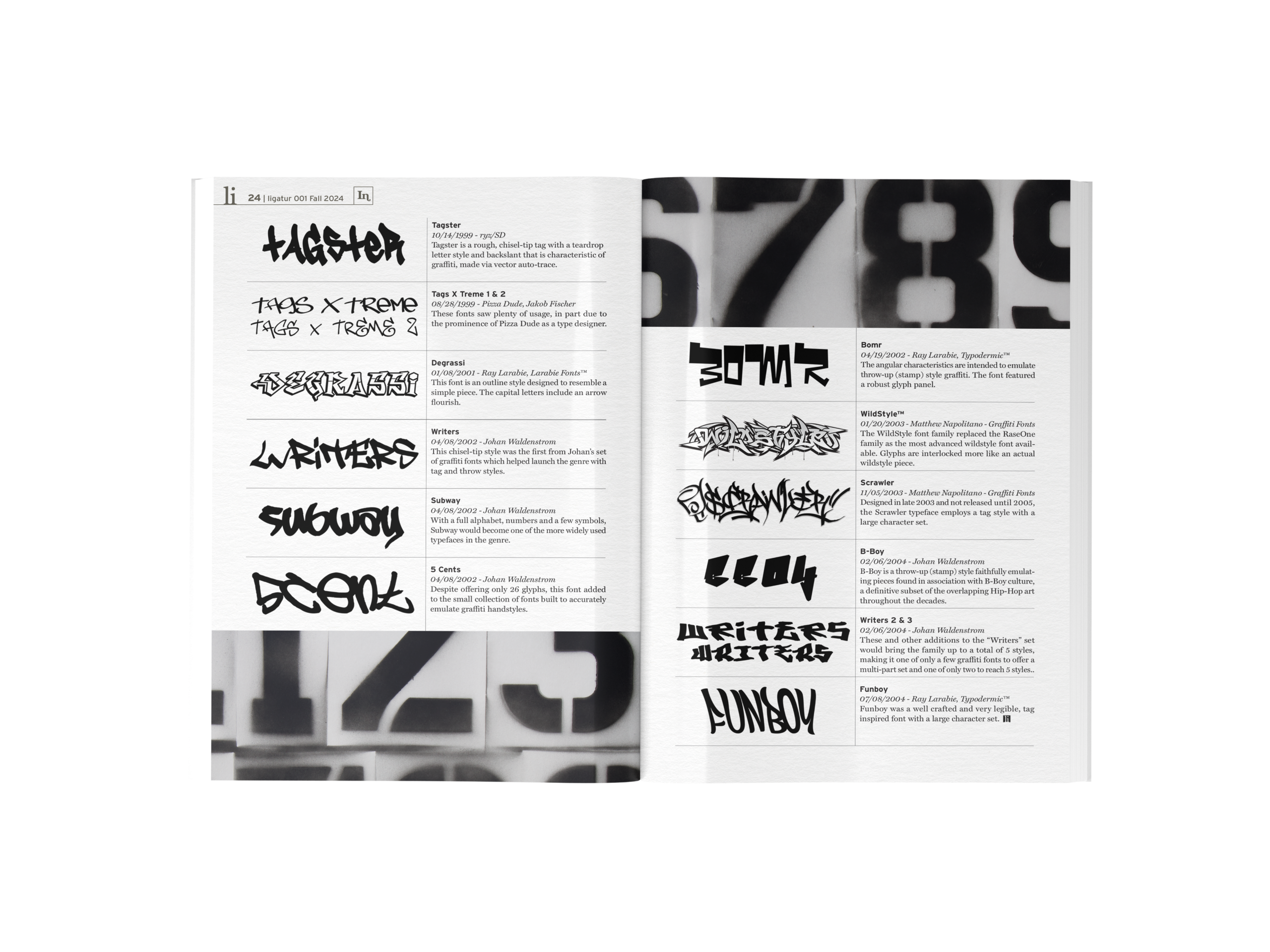
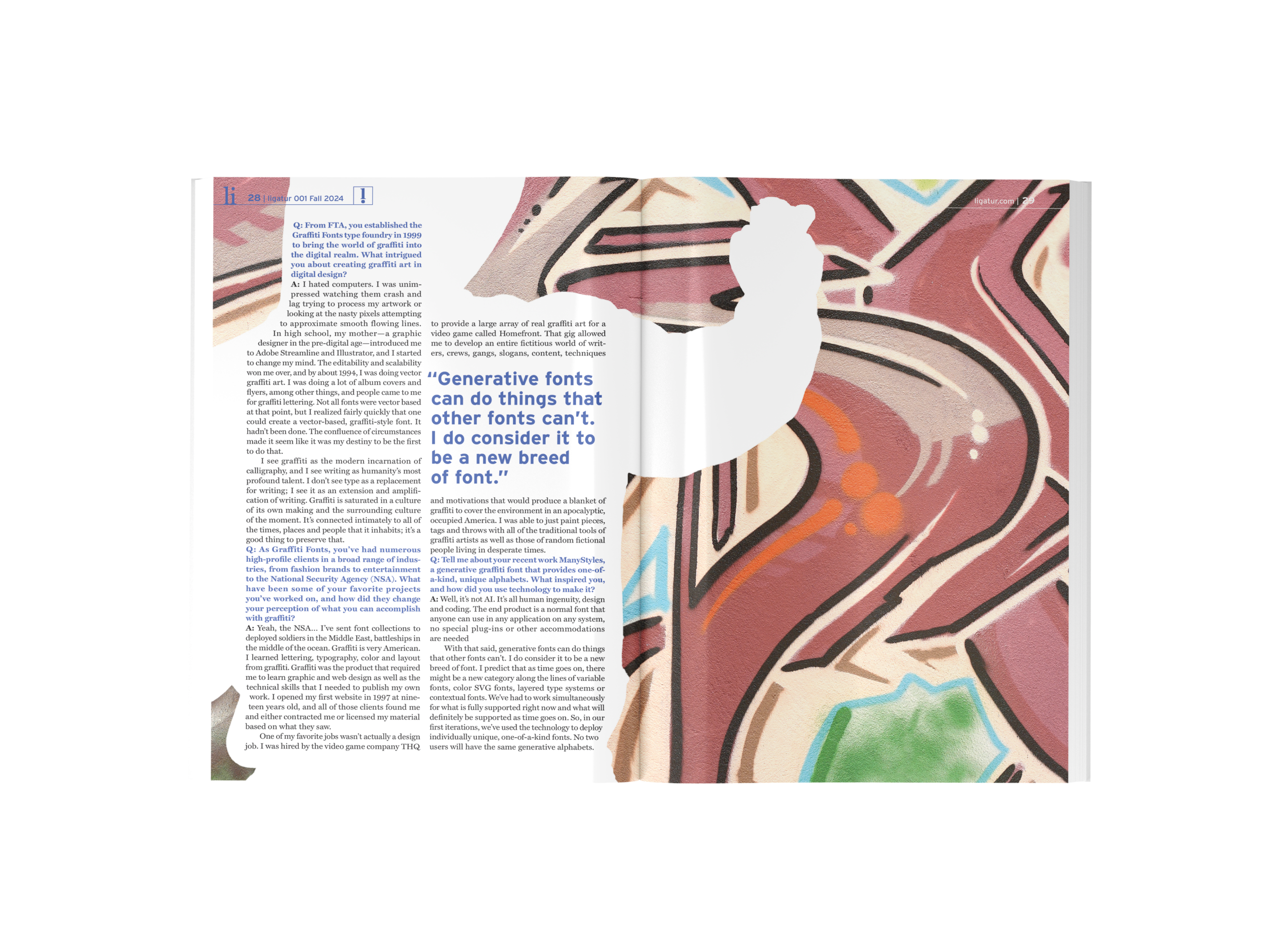
The design balances an authoritative voice with visual boldness — a necessity for a publication targeting designers, who expect to see strong work. This balance is achieved through established typefaces like Miller and Interstate, largely geometric layouts, and physically created artwork, which lends the publication an innate sense of legitimacy. A neutral primary palette establishes credibility, while vivid secondary colors create accent, focal points, and organizational structure. Fine details like postmaster information, subscription codes, and mailing addresses were included to make the publication feel genuinely in circulation. Content flows from digestible context and infographics at the opening — hooking the reader and seeding later topics — into a comprehensive chronological deep dive into typographic history.