Portfolio Category: Advertising

  • Harbor Freight Print Ads

    Harbor Freight Print Ads

    About

    Harbor Freight is America’s largest tool retailer, built on a straightforward promise: high-quality tools at the lowest prices, made possible by working directly with manufacturers and cutting out the middleman.

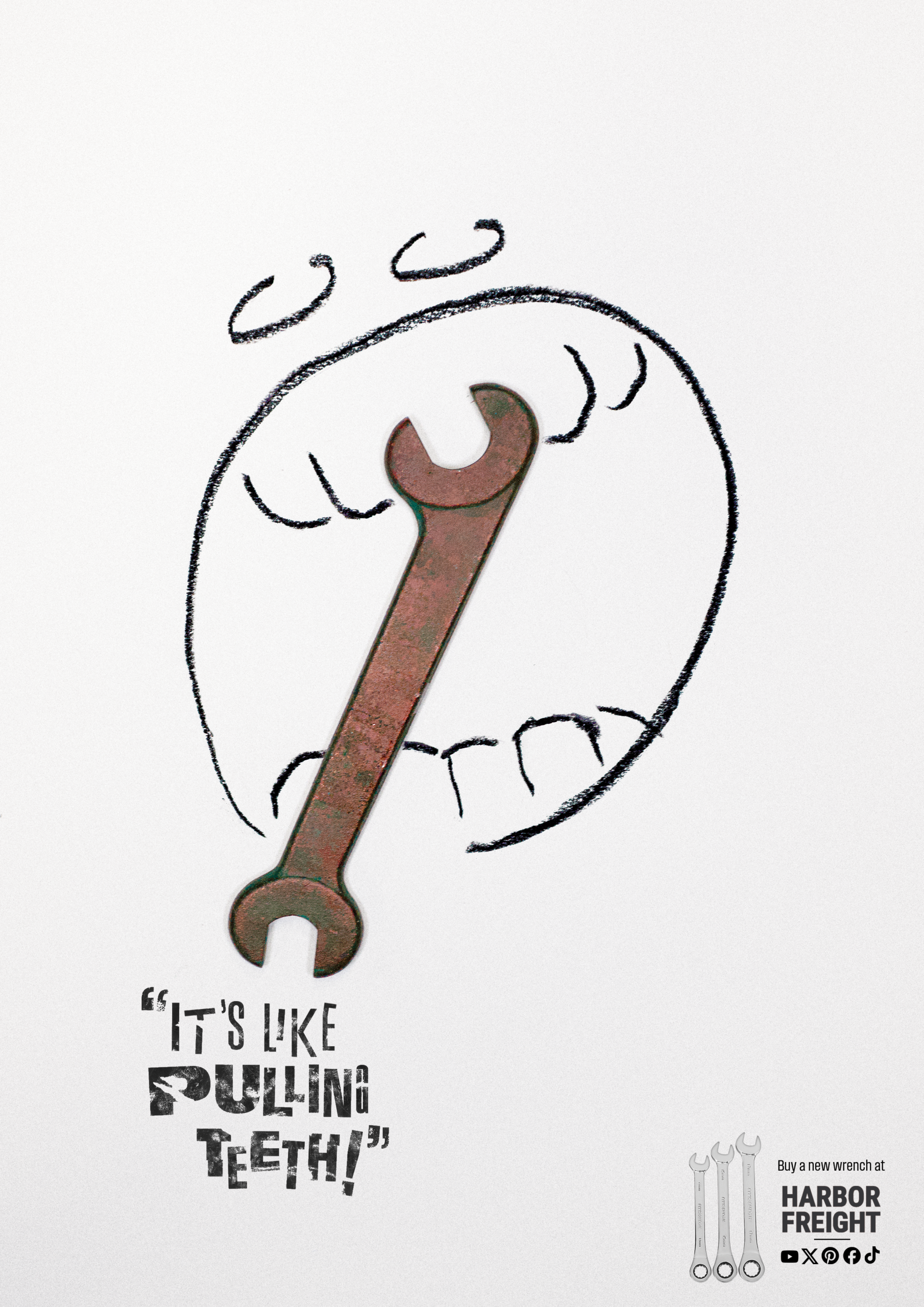
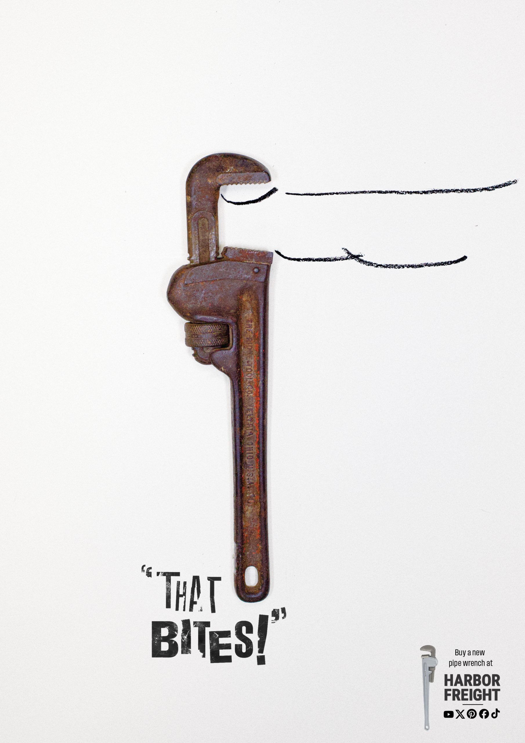
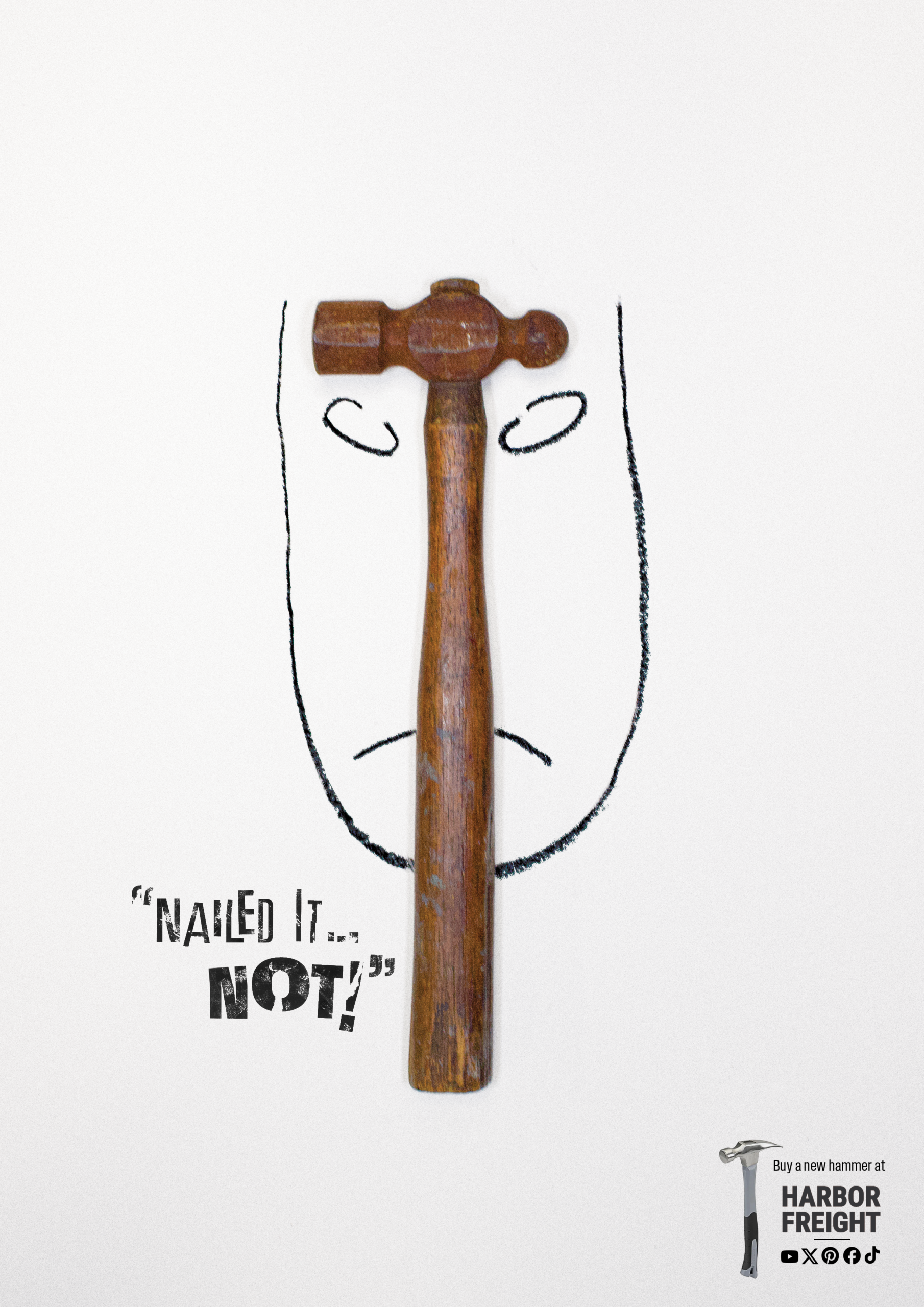
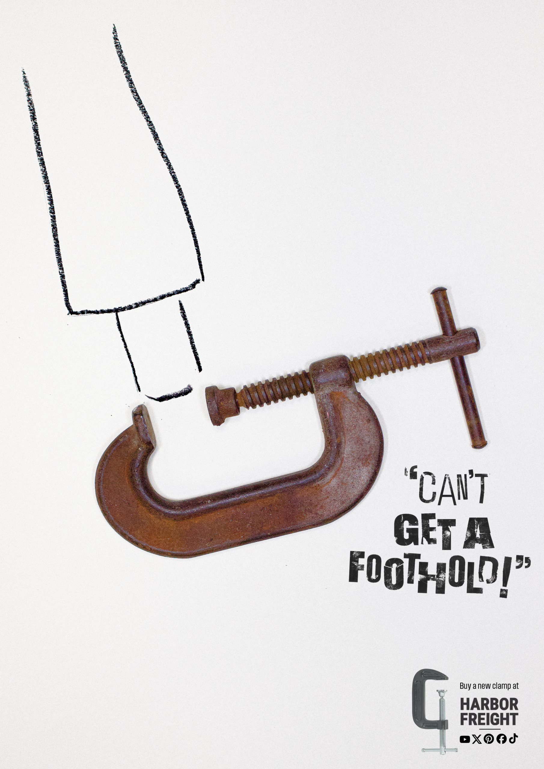
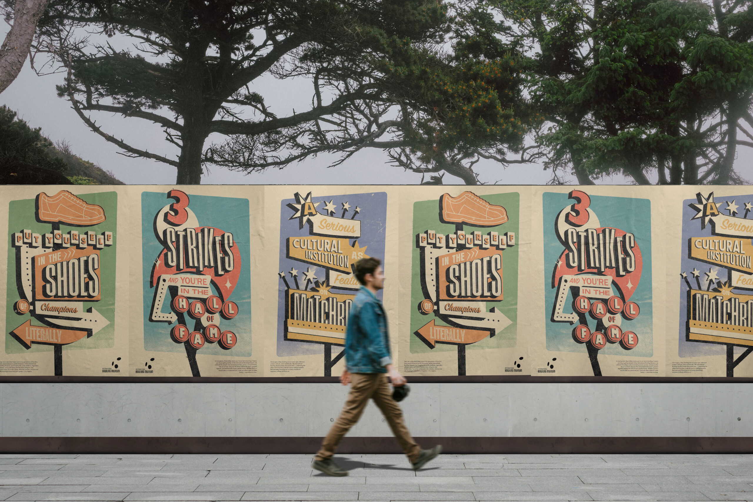
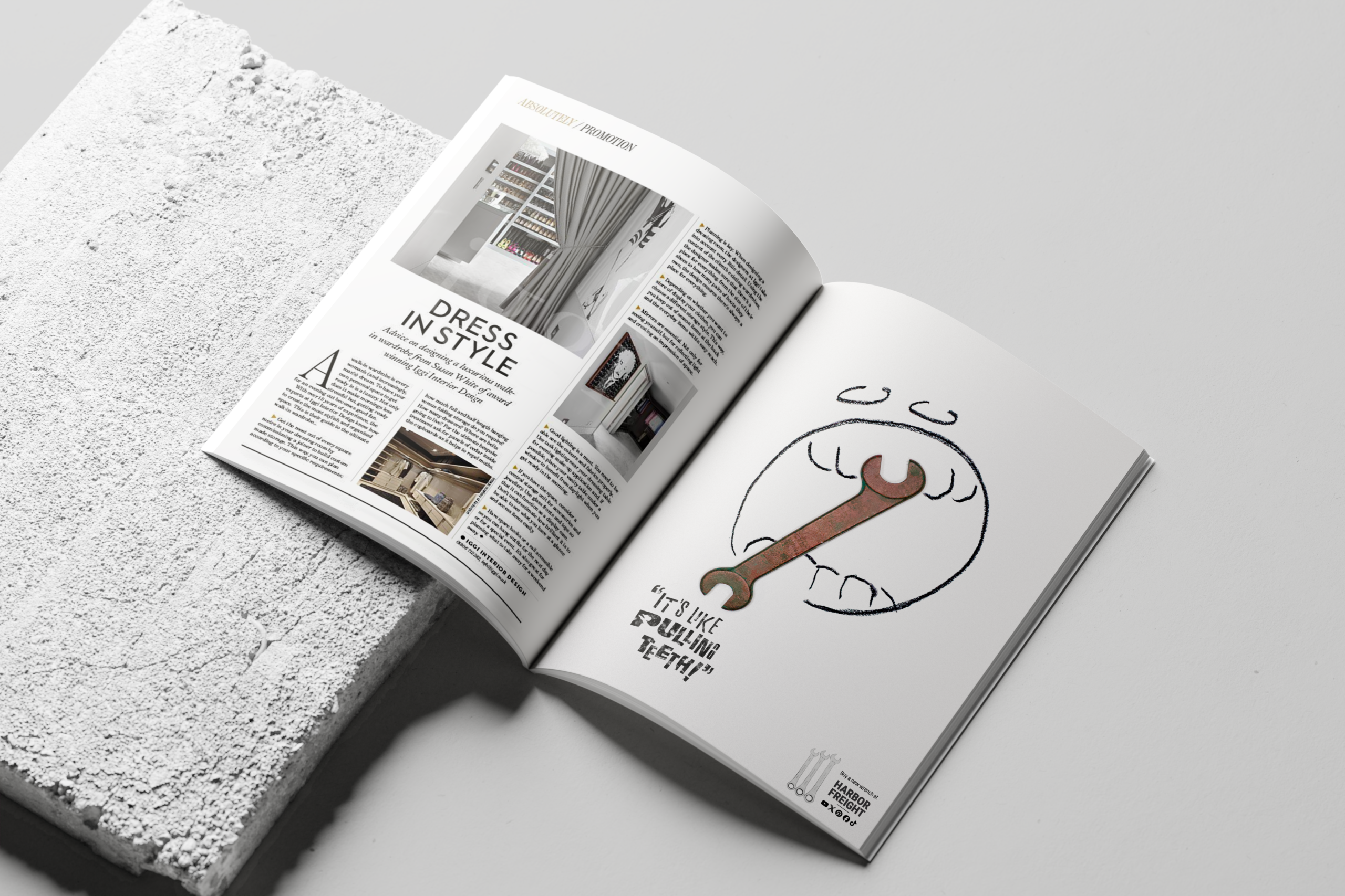
    This campaign consists of four full-page magazine ads pairing antique, deteriorated tools with loose, gestural illustrations of human body parts — exaggerating the physical and emotional frustration of tools that no longer work. Short, ironic headlines like “Can’t Get a Foothold!” and “Nailed It… Not!” let viewers immediately recognize themselves in the scenario. Each composition guides the eye from the broken tool to a clean, modern replacement and a simple call to action: buy a new one at Harbor Freight.

    The scrappy, handmade aesthetic mirrors Harbor Freight’s no-nonsense brand personality and speaks directly to its DIY-focused audience — nothing feels overproduced, reinforcing the idea that practical tools don’t have to come at a premium. Ultimately, the campaign shifts the conversation from price alone to permission — giving customers permission to stop making do with tools that have failed them, because replacing them doesn’t have to be expensive.

  • International Bowling Museum Posters

    International Bowling Museum Posters

    About

    The International Bowling Museum & Hall of Fame sits inside the International Bowling Campus in Arlington, Texas — directly adjacent to Six Flags Over Texas, yet largely invisible to the millions of visitors passing by. This poster series was designed to change that, paired with a logo rework to improve the museum’s scalability and legibility across applications.

    Headlines were written first, leaning into the quirks of bowling culture — such as the fact that shoes are shared between strangers. Each headline was then developed through typographic and compositional iterations before shapes were introduced. Illustrator’s 3D Extrude and Bevel effect was applied to simulate an upward-looking perspective, as if the viewer stood beneath a large roadside sign. The final shapes were expanded into vectors, recolored, and textured in Photoshop.

    The series draws from the golden age of bowling — the 1940s and 50s — through typefaces like Franklin Gothic, Neuzeit Grotesk, and Futura, and a vintage signage aesthetic. Each poster pairs that look with a tongue-in-cheek headline: “Put yourself in the shoes of champions — literally” nods to bowling’s shared-shoe culture. The goal is a campaign memorable enough to turn a passing glance into a visit.