Portfolio Category: Publication

  • Insomnia Cookies Catalog

    Insomnia Cookies Catalog

    About

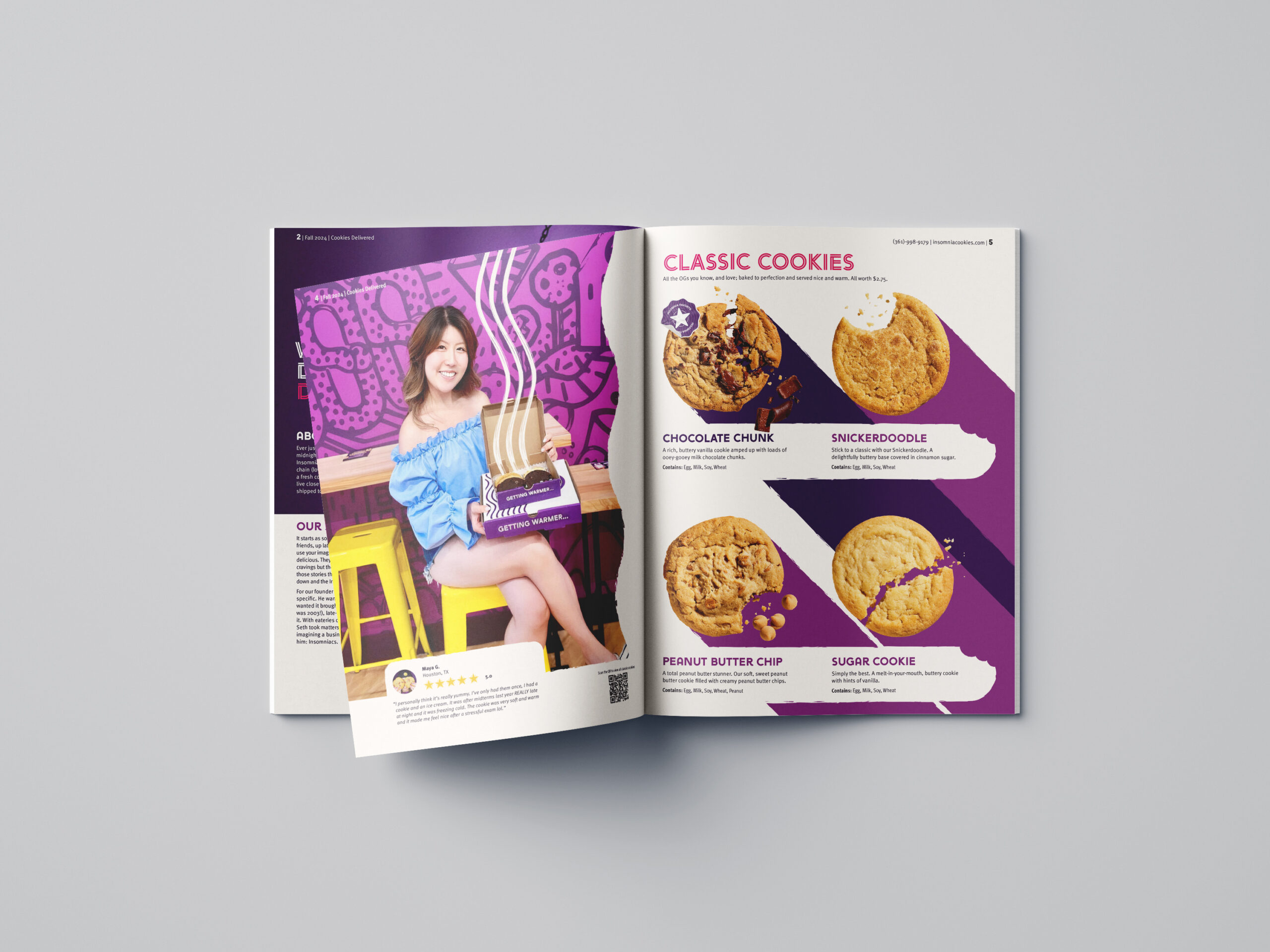
    Insomnia Cookies began in 2003 when University of Pennsylvania student Seth Berkowitz started baking and delivering warm cookies around campus — a late-night alternative to the heavy delivery options available to students. Today it has grown into a nationally recognized brand built on that same late-night, made-fresh premise.

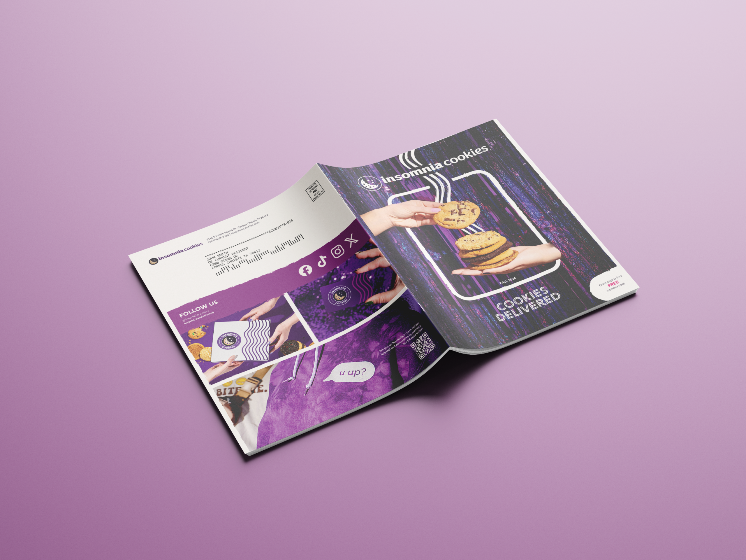
    For this project, students were tasked with creating a fully realized catalog from the ground up — developing a grid system, creating original assets, curating photography, and sourcing copy. Insomnia Cookies’ strong existing identity provided a strong foundation; the brand’s signature purple palette and smooth zigzag lines were carried throughout the design.

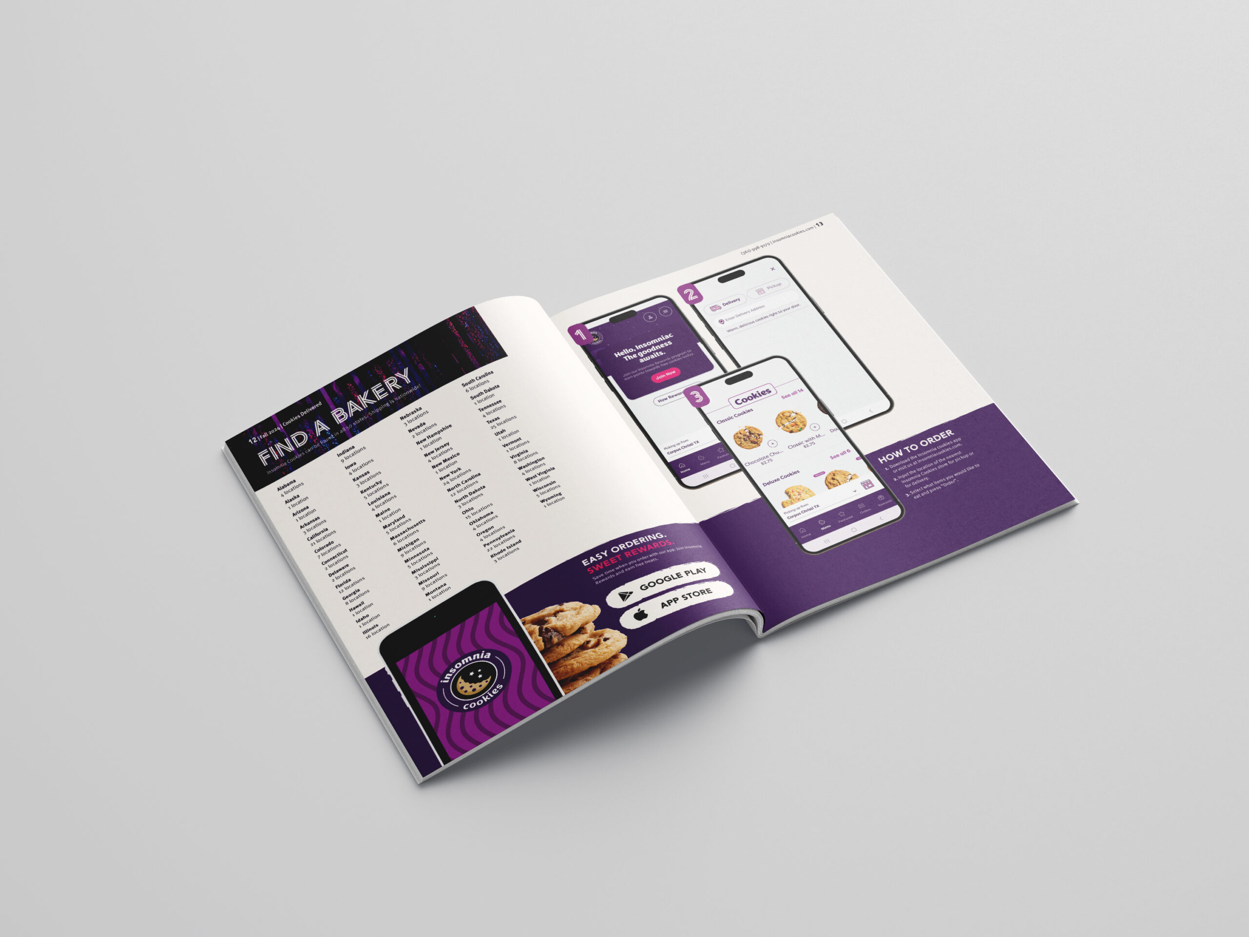
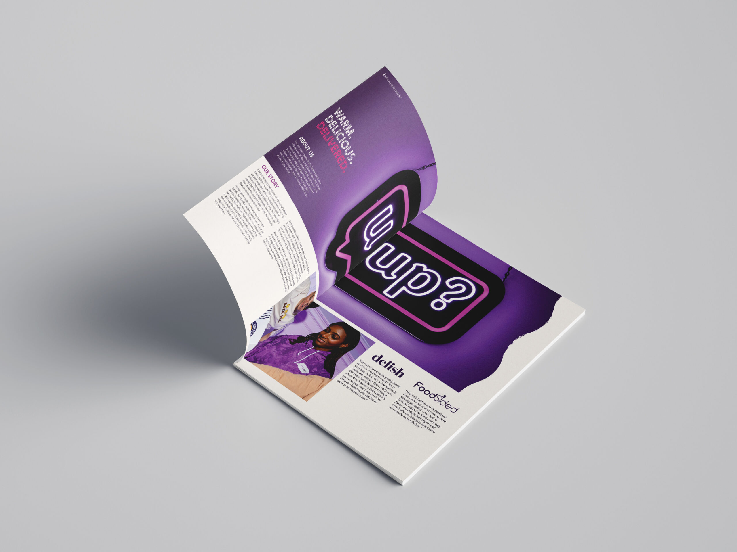
    The catalog’s theme, “Cookies Delivered,” informed every visual decision. The cover depicts one hand dropping cookies into another, implying an exchange mid-delivery. Diagonal lines functioning as drop shadows suggest motion, while wavy abstract lines evoke rising steam — engaging the viewer’s senses before a single menu item is seen. Page order moves deliberately from brand story to menu to ordering information, letting the photography do its work before presenting a call to action. Textures applied throughout soften the layouts, making them feel informal and fun rather than corporate — consistent with the brand’s personality. Embedded QR codes and calls to action encourage further engagement with the brand beyond the page.

  • Ligatur. Magazine

    Ligatur. Magazine

    About

    Ligatur. is a 6×9in typography publication released bi-annually — a format chosen deliberately. The smaller trim size distinguishes it from letter-size competitors, improves portability, and reinforces the brand’s understated voice. The bi-annual schedule aligns with university semesters, reflecting that students and designers make up the core readership. The name carries a double meaning: a ligature is a typographic feature connecting two or more letterforms, mirroring how the magazine connects typographic history to the present day. The German spelling nods to Germany’s outsized influence on the field — from Gutenberg’s press to the Bauhaus.

    The design balances an authoritative voice with visual boldness — a necessity for a publication targeting designers, who expect to see strong work. This balance is achieved through established typefaces like Miller and Interstate, largely geometric layouts, and physically created artwork, which lends the publication an innate sense of legitimacy. A neutral primary palette establishes credibility, while vivid secondary colors create accent, focal points, and organizational structure. Fine details like postmaster information, subscription codes, and mailing addresses were included to make the publication feel genuinely in circulation. Content flows from digestible context and infographics at the opening — hooking the reader and seeding later topics — into a comprehensive chronological deep dive into typographic history.