About
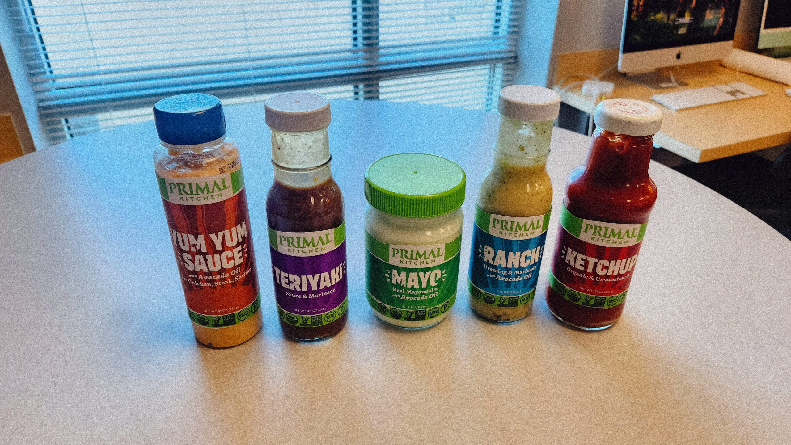
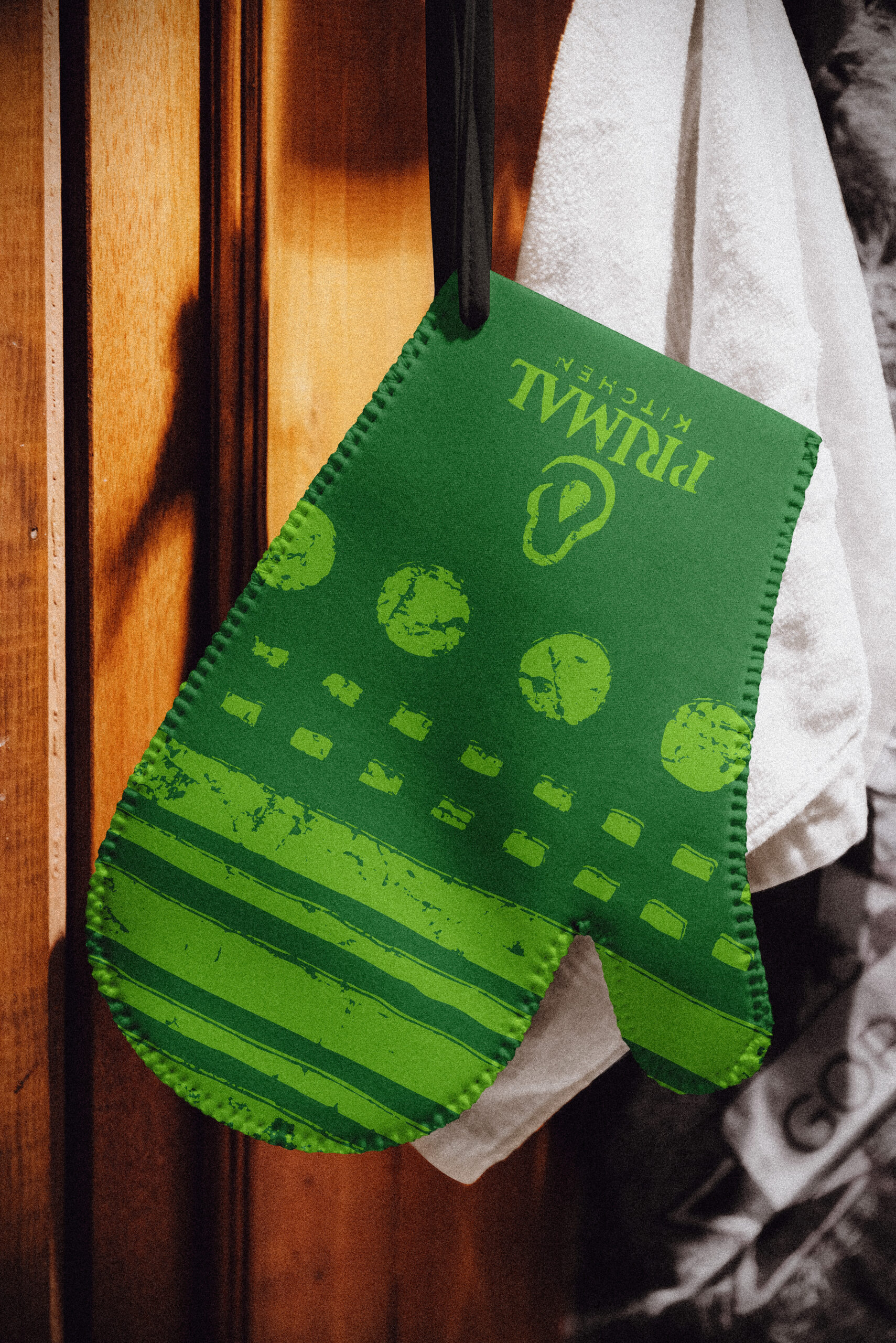
Primal Kitchen is a health food brand specializing in condiments as well as dressings formulated for keto and paleo diets, with the presence of avocado oil being a core differentiator. The business has been attempting to shift their focus towards Generation Z consumers, so this refresh incorporates on-trend design while refining the identity as a whole. The previous caveman logomark was replaced with an avocado—already omnipresent across packaging—resolving scalability issues while more clearly communicating the brand’s identity. The primary color was preserved after competitor research confirmed its market differentiation and equity; new earthy supporting tones signal an organic, handcrafted quality. Kodak Ektar 100 film presets were selected for imagery, lending authenticity while appealing to Gen Z’s affinity for analog aesthetics. The “Primal Sunburst” brand element was elevated in prominence, while the pre-existing geometric shapes were reframed to be mostly utilitarian elements.