Portfolio Category: Packaging

  • Marty McPies Rebrand

    Marty McPies Rebrand

    About

    Marty McPies is a scratch-made pizzeria in downtown Corpus Christi, Texas. This project was guided by a central mission: how can we entice more Corpus Christi locals and tourists to visit Marty McPies’ physical location? Primary and secondary research revealed two interconnected obstacles — limited visibility in a busy downtown setting, and a lack of accessibility features for customers with disabilities.

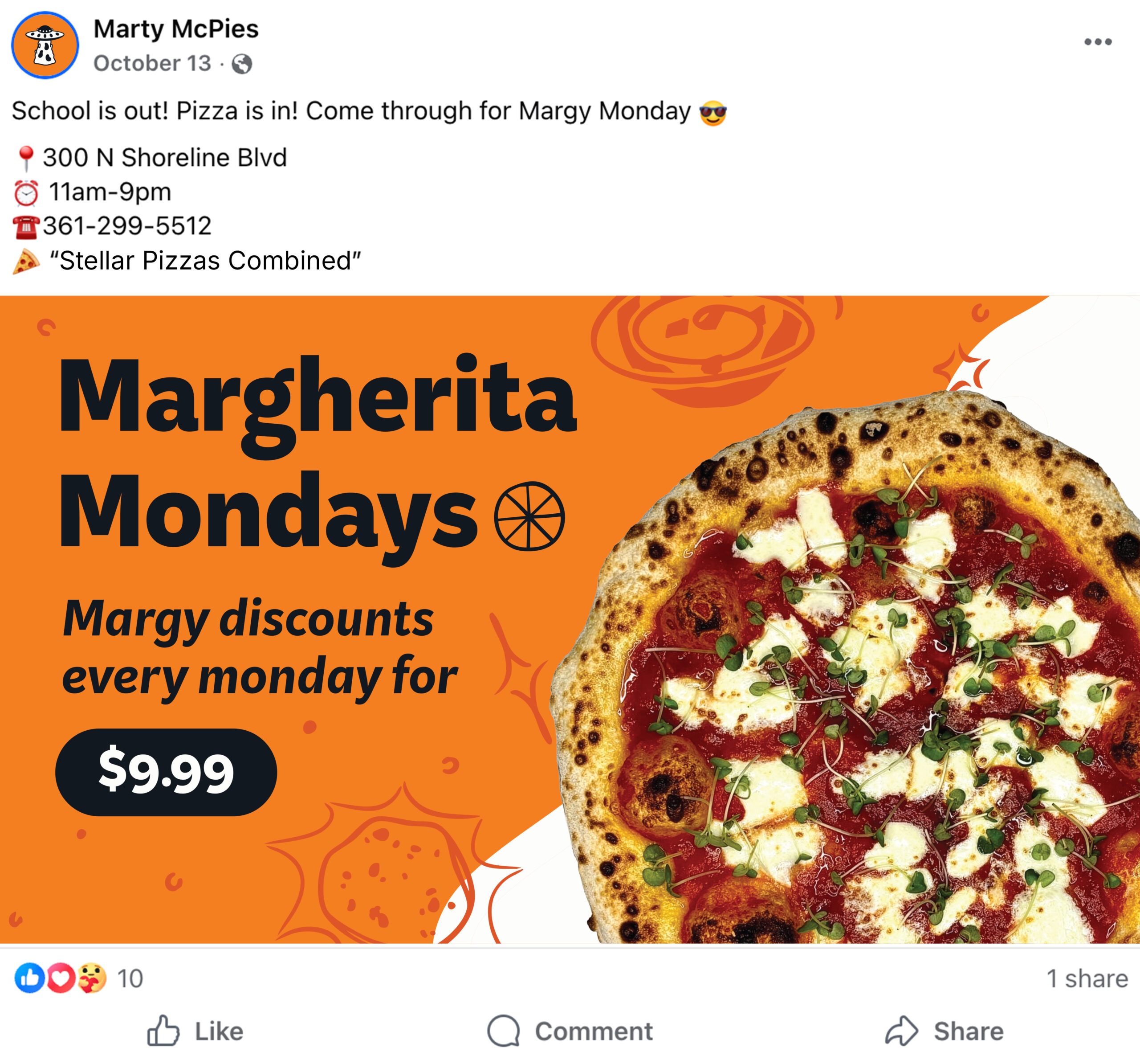
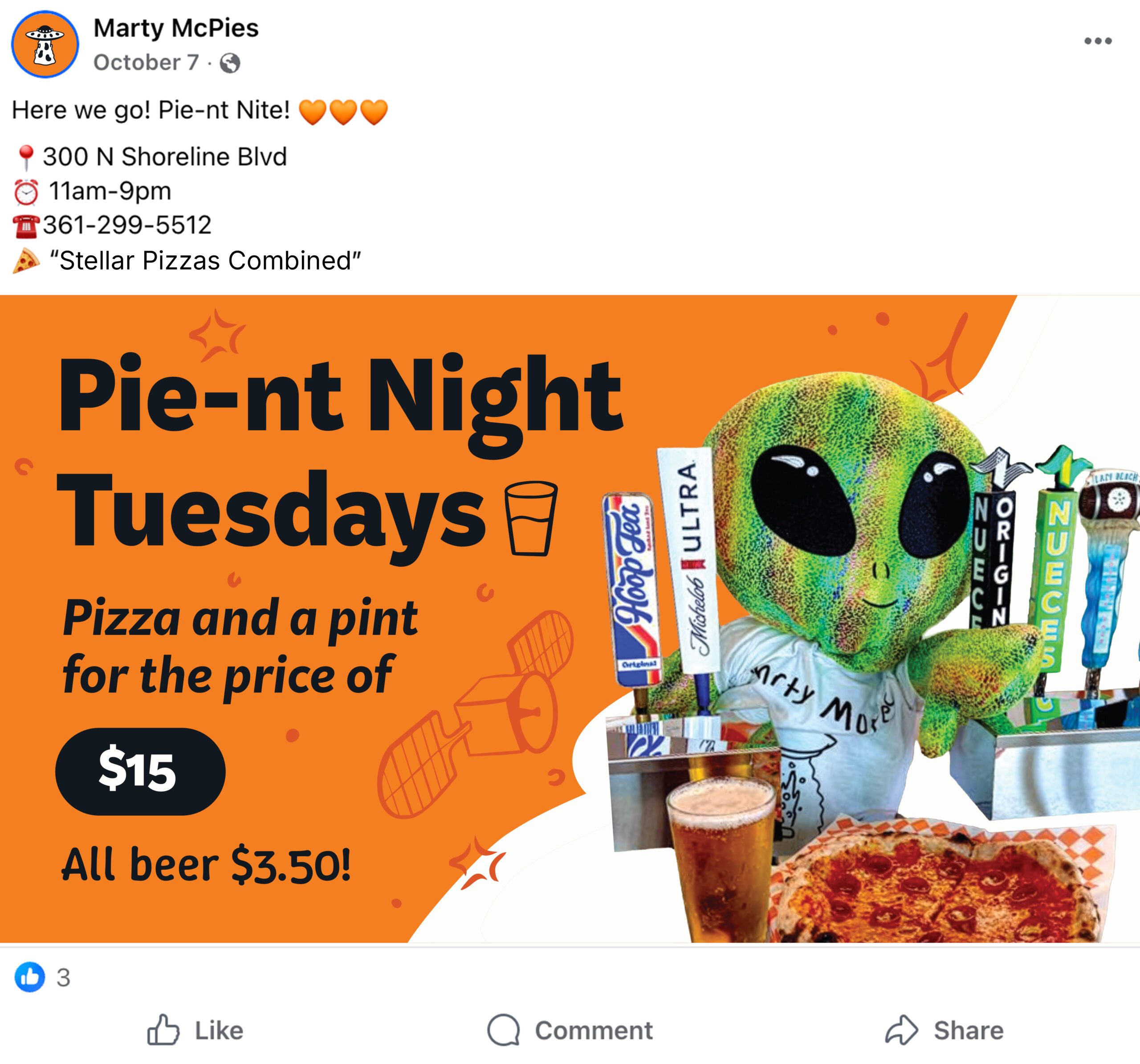
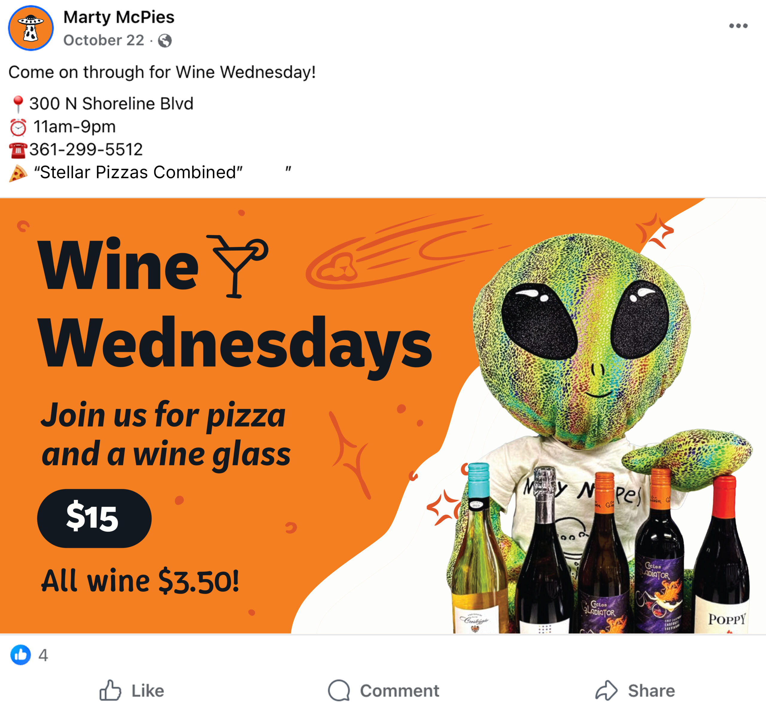
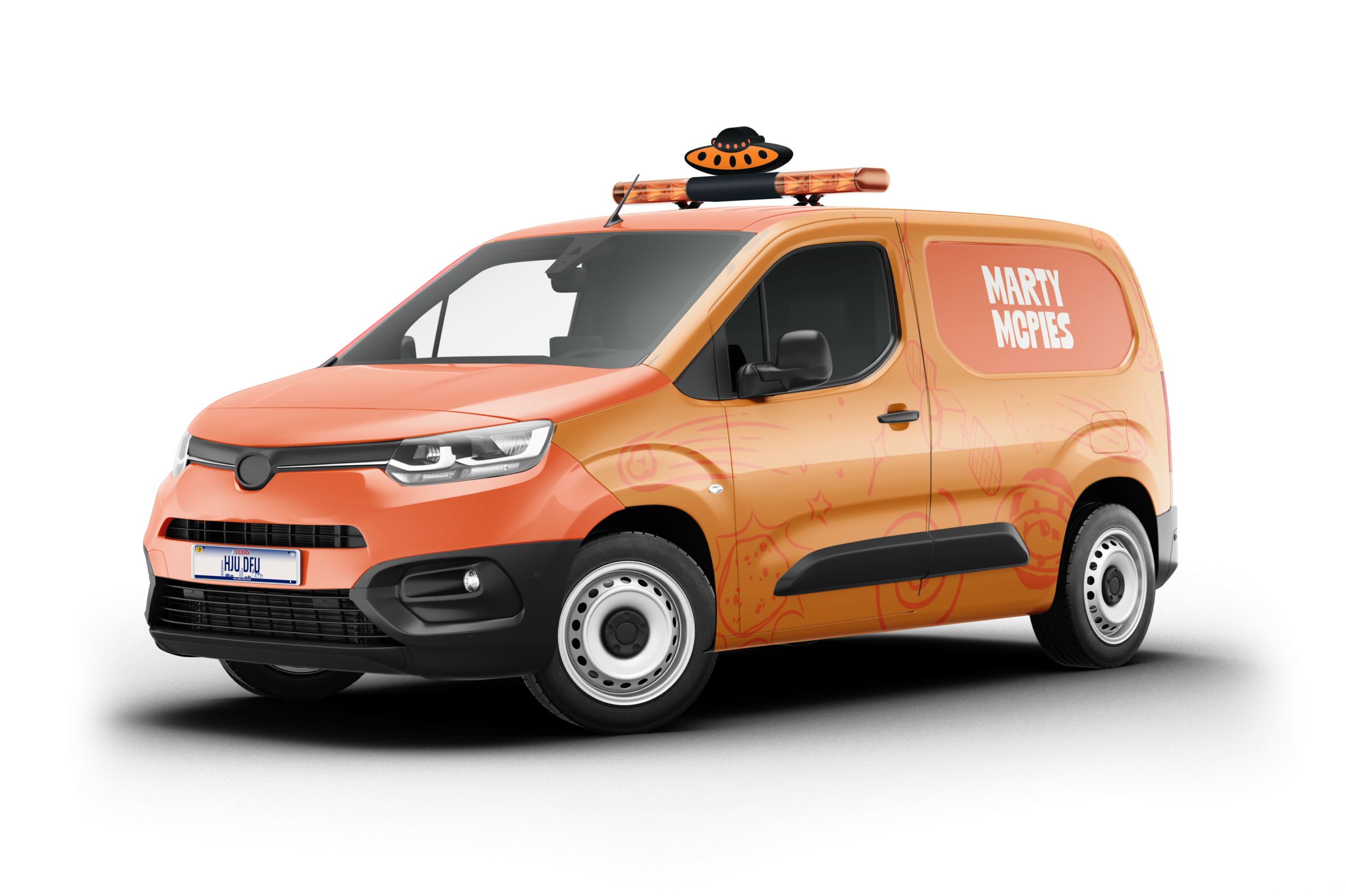
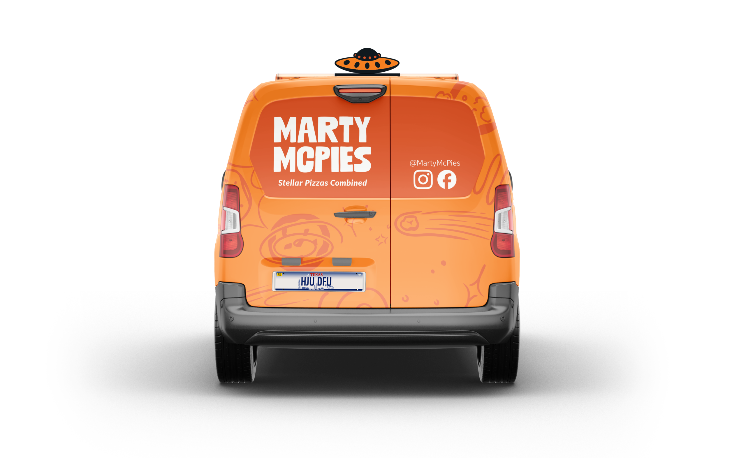
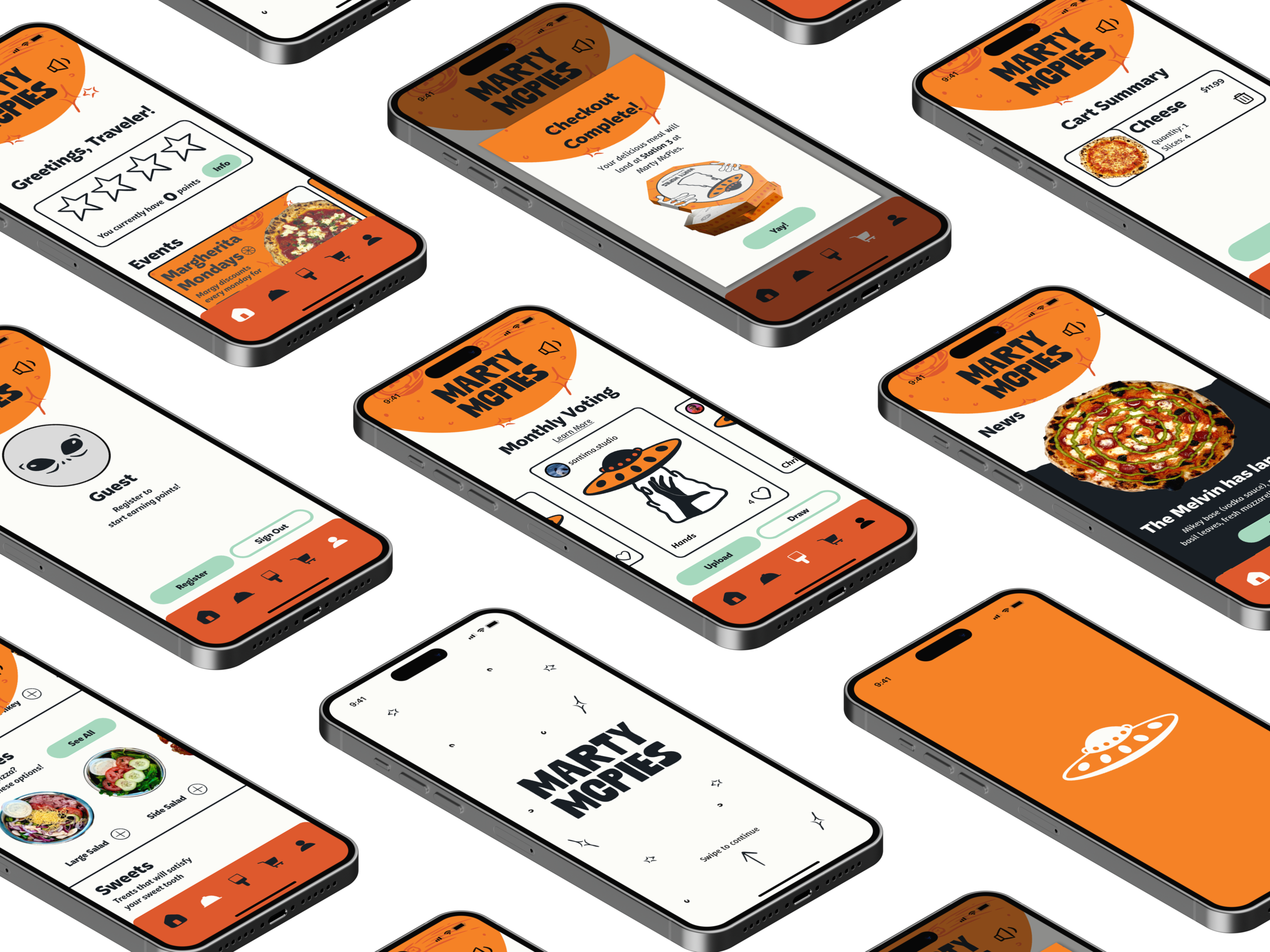
    The existing logo was refined rather than replaced, preserving the UFO while making it more scalable and dynamic. The UFO beam was redesigned to resemble a pizza slice, directly nodding to the product. A customizable element was introduced allowing customers to draw within the beam — inviting word-of-mouth marketing through a unique, participatory brand experience. Submissions are eligible for a monthly competition hosted by the brand. A new illustration system was also developed to streamline and unify visuals across all brand collateral. The color palette was audited for color blindness compliance, and new patterns were introduced to better differentiate the brand from competitors. A new rooftop restaurant sign was created, significantly increasing the location’s visibility from the surrounding area.

    On the accessibility side, tactile floor decals guide customers to the register and restrooms, and braille menu options were explored — ensuring the Marty McPies experience is one that anyone in Corpus Christi can find and enjoy.

  • GAIA Sustainable Art Supplies

    GAIA Sustainable Art Supplies

    About

    GAIA is a sustainable art supply brand that reimagines creative tools through an ethical, environmentally conscious lens. Inspired by the Greek personification of Earth, the project explores how branding and packaging can reconnect art-making with its natural origins. Developed through research into industry practices and consumer values, GAIA positions itself as a response to the hidden environmental and social costs of traditional art materials—offering a system where creativity and responsibility coexist. The visual identity reinforces this concept through a color palette of deep blues, mineral greens, and warm neutrals that both imply sustainability and reference the tones of ancient Greek art and landscapes, grounding the brand in both history and nature.

    At the core of the brand is a commitment to transparency, sustainability, and premium craftsmanship. The product line includes biodegradable beeswax oil pastels and recycled colored pencils, packaged in reusable and recyclable formats designed to reduce waste while maintaining a high-quality user experience. The packaging system draws inspiration from ancient Greek pottery, with illustration styles that echo classical forms while incorporating textured, imperfect mark-making that reflects the tactile quality of the materials inside. Each package is wrapped with a seed paper belly band that can be removed and planted, allowing the product to give back to the Earth by creating new life—an extension of GAIA’s philosophy that creativity should be regenerative rather than extractive.

  • Vellé Sparkling Coffee

    Vellé Sparkling Coffee

    About

    Vellé is a sparkling cold brew coffee brand inspired by European café culture — blending premium cold brew with crisp carbonation and natural flavors for a sophisticated, refreshing alternative to traditional energy drinks.

    The visual direction draws from Art Deco, Cubist, and Futurist design movements. The logomark — an abstract swoosh — conveys elevation and energy, nodding to the product’s ability to wake you up. Packaging compositions are centrally aligned to maximize the can’s visual real estate while maintaining clear hierarchy. Fruit illustrations are rendered in a deconstructed, Cubist style built from basic geometric shapes, creating visual cohesion with the logomark while implying a premium tone through abstraction. An omnipresent grain texture runs across all packaging, evoking the product’s carbonation. Legal details such as manufacturer information and serial numbers were referenced from real cans for authenticity.

    As a supplementary experience, an augmented reality feature was built using Adobe Aero — activated via packaging, it walks users through Vellé’s product features and rewards completion with a discount code.